CSS Layout: doing it three ways
When I started doing CSS, and coolly switching background-colors with a word or two, I was horrified to discover that layouts are so difficult.
After all, I thought, layouts were the whole damn point of CSS in the first place. Well, turns out they’re a lot easier now than they were 10 years ago. But even then, they’re not that easy.
It’s why people use bootstrap css all the time. It just puts shit in the centre of the page and lines it up nicely. And god knows it’s kind of a faff doing it any other way.
 That’s supposed to become a navigation bar? Turning a UL element into a navigation bar requires more heavy-lifting in CSS than you would hope
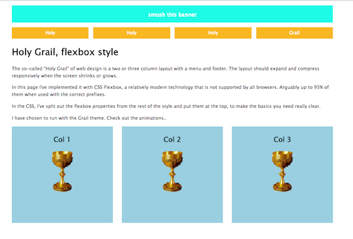
One of the tasks I set myself on github was to create the “holy grail” of web design - a responsive three column layout with a navigation bar at the top. But I decided to do it three times over.
1. Once with ‘float’ and ‘block/inline-block’ properties
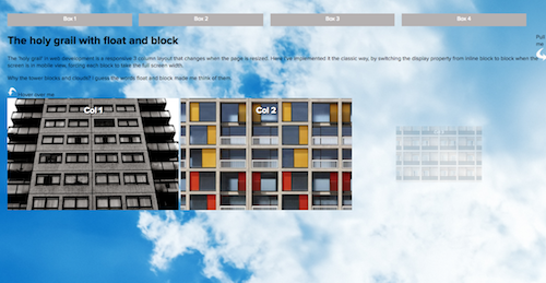
This is the classic way of doing CSS layout right now, it’s widely-supported and responsive. Just about.
2. A second time with flexbox
3. A third time with grid
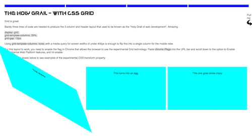
Grid is an experimental CSS property that, yes produces grids. Nice flexible grids, with hardly any code needed at all. I really like this one. Grid is described here on MDN.
To view this site you need to go into Chrome or whichever browser you are using and enable experimental features: Paste chrome://flags into the URL bar and scroll down to the option to Enable experimental Web Platform features.
I also delve into some fun CSS transitions and transforms because why the hell not. I really like skew.
See the code: The Holy Grail - 3 ways on Github